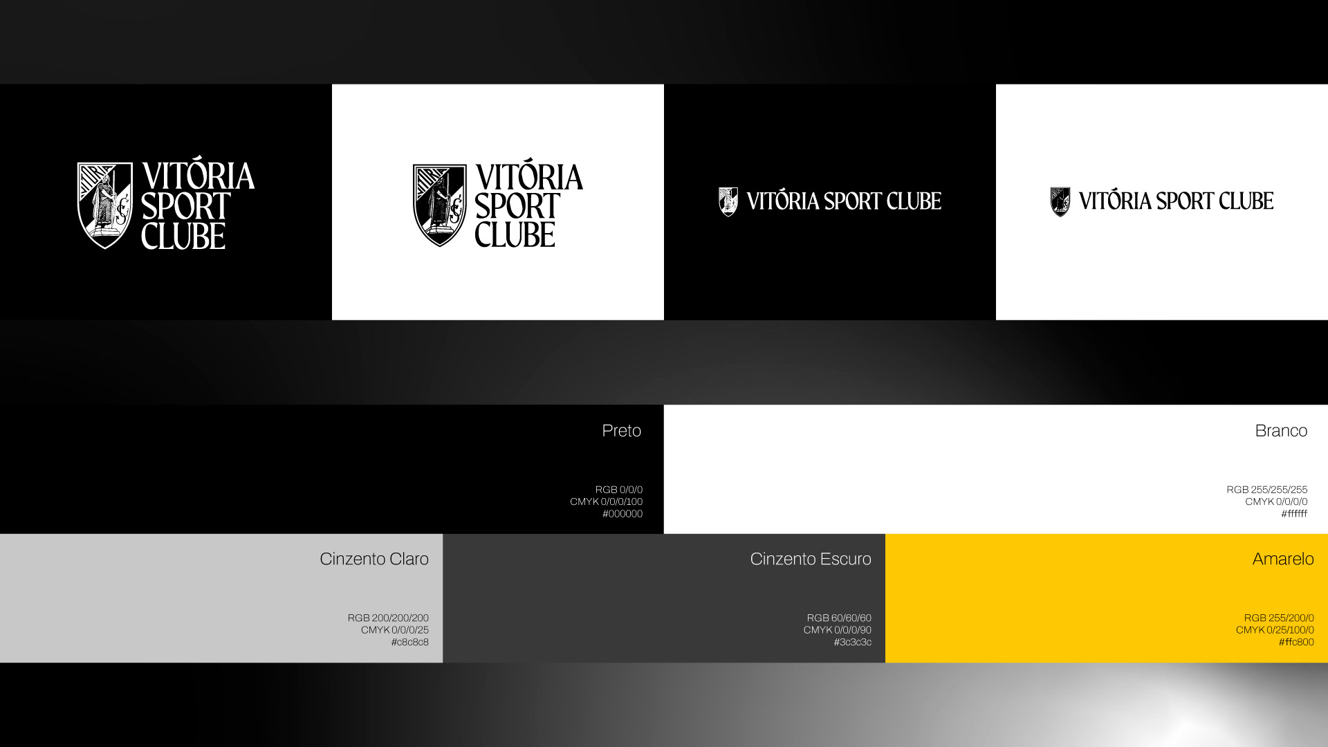
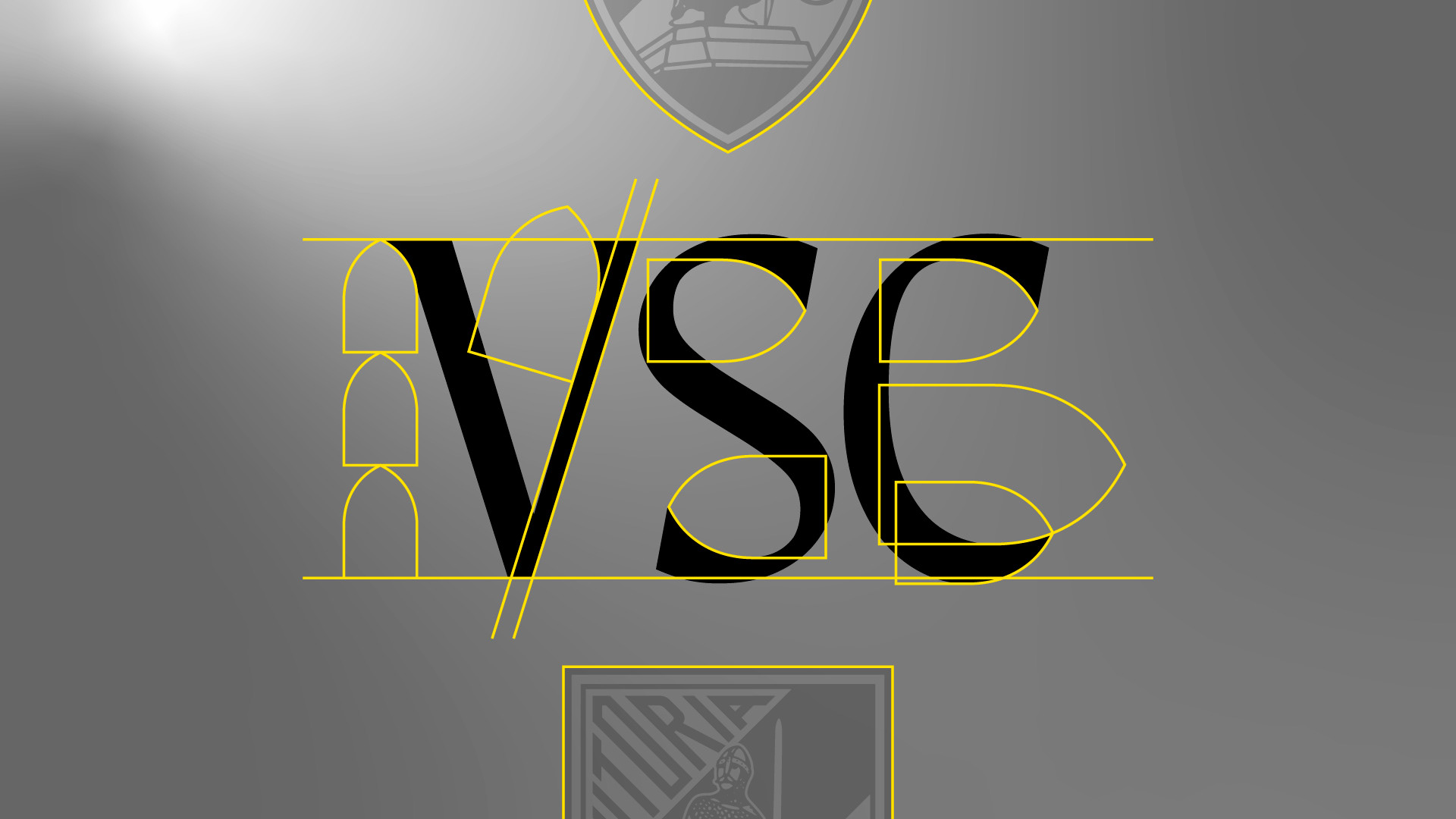
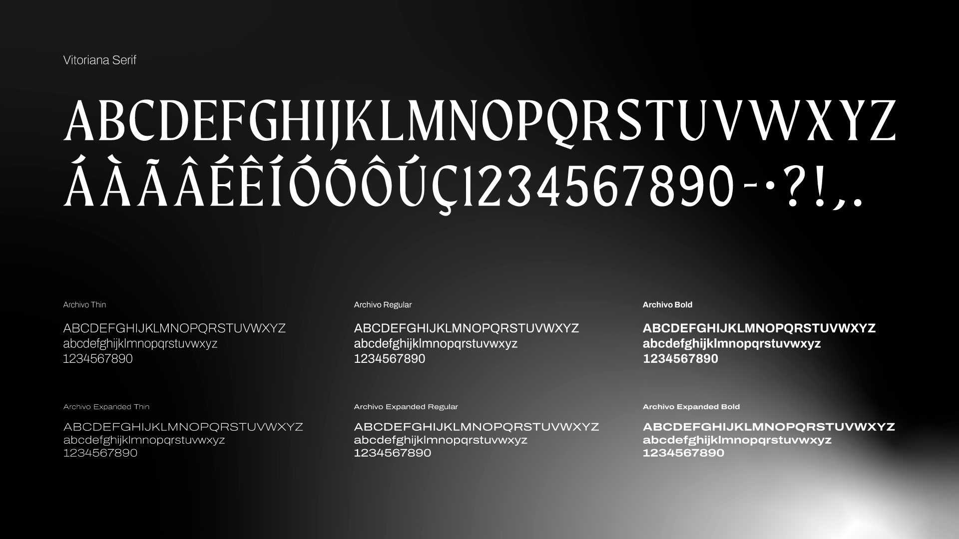
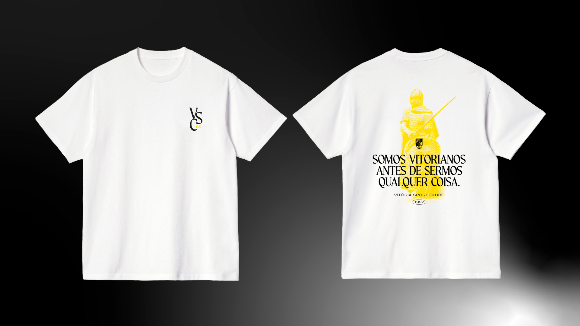
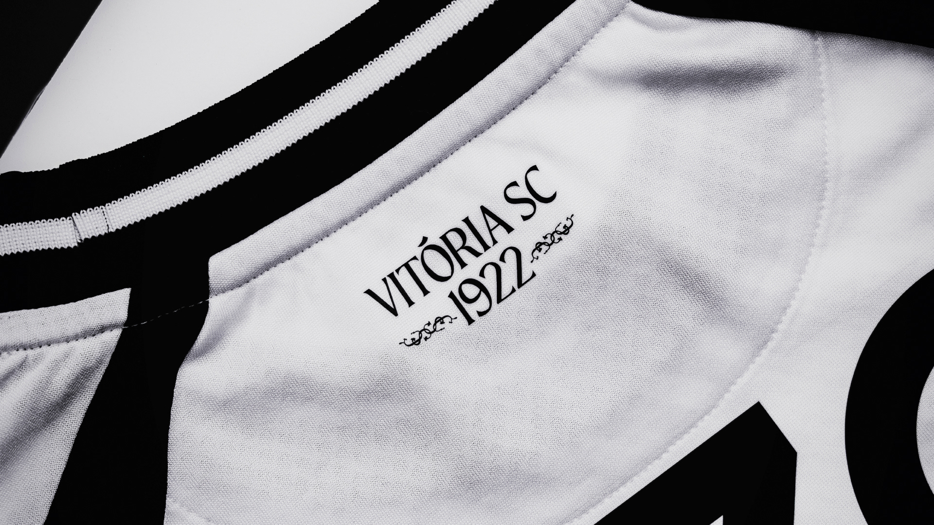
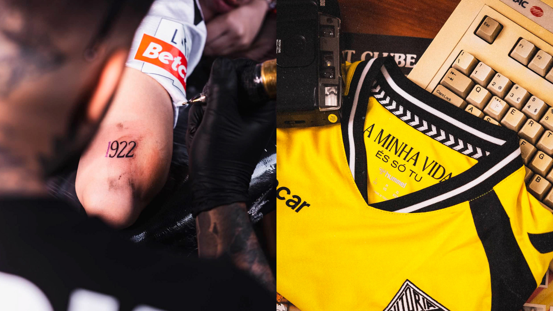
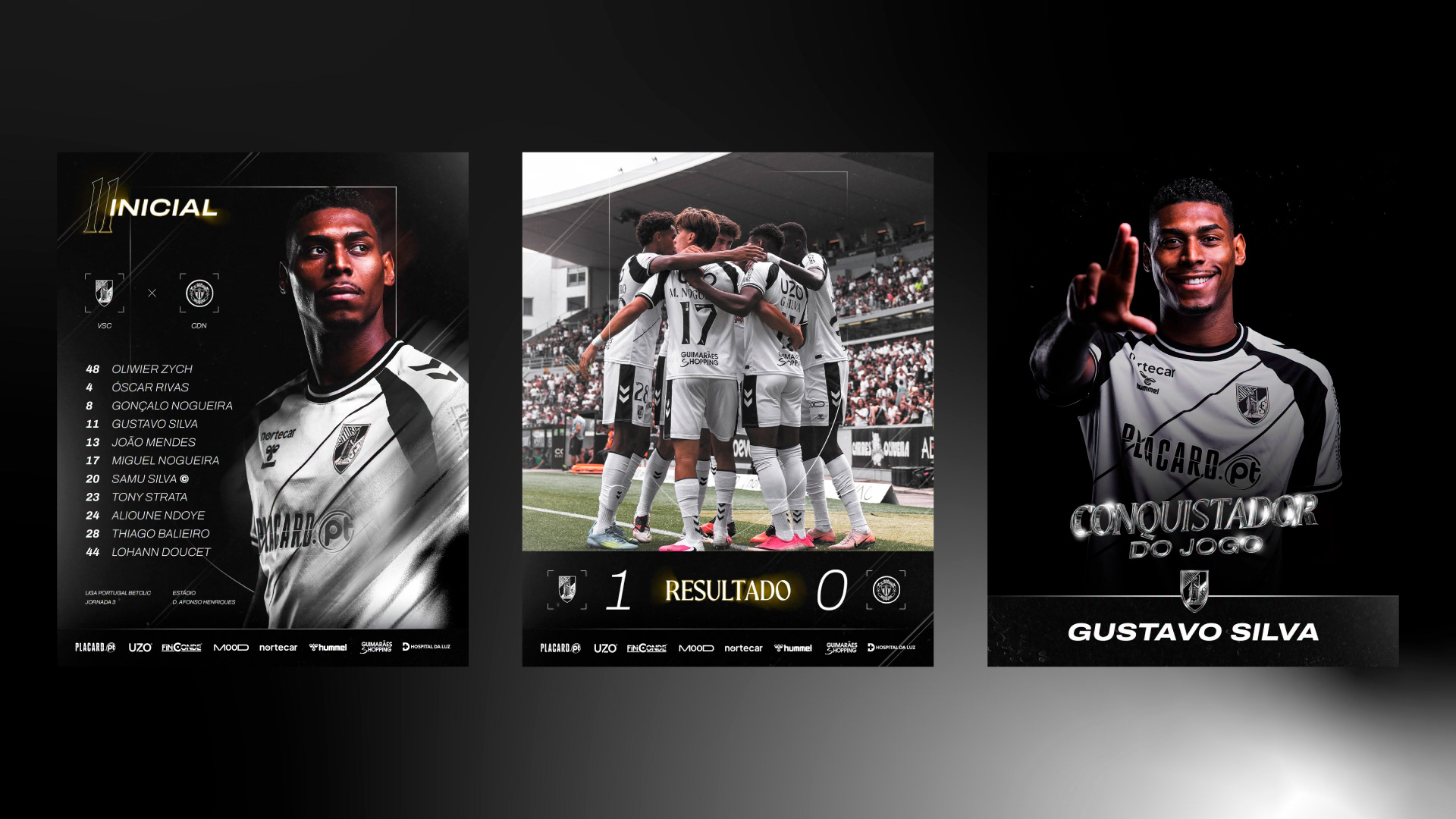
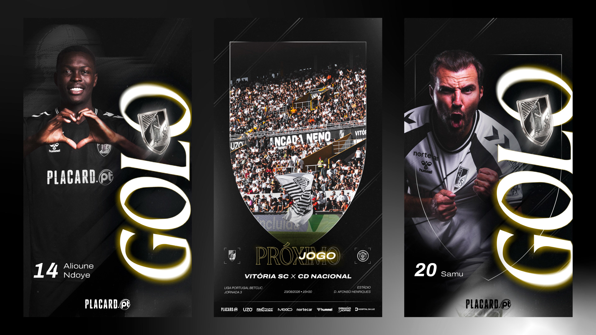
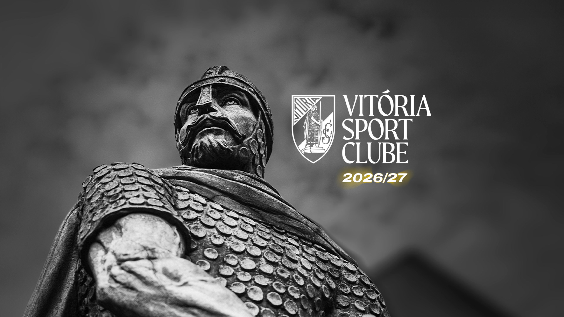
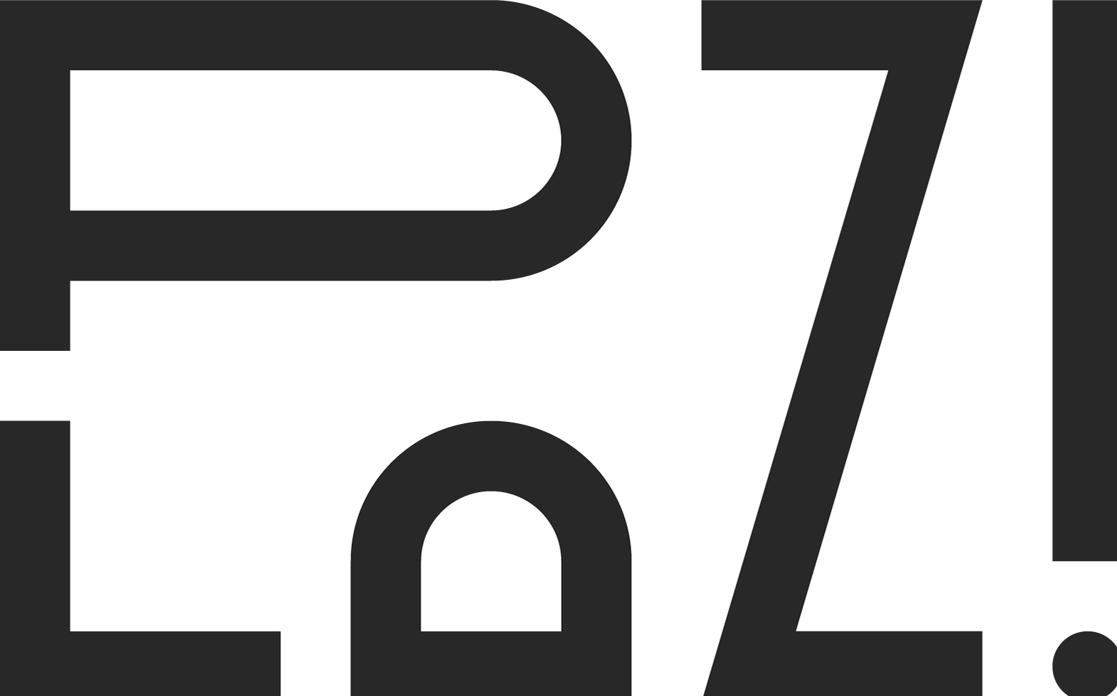
Vitória Sport Clube had a visual identity built over the years from different elements, but without a system that clearly defined how they should be used together. The challenge of this project was not to create a new symbol or replace the crest, but rather to establish a set of rules capable of organising, standardising and strengthening an identity that already existed. The first step was to establish a coherent visual system, defining a colour palette, typography, complementary graphic elements and usage guidelines that would allow for greater consistency across the brand’s different touchpoints. Some elements that were already part of the Club’s visual universe were brought back and developed within this new system, while others were adjusted or redesigned to eliminate the lack of consistency that often made Vitória Sport Clube’s communication visually confusing. But beyond organising what already existed, the project also aimed to create something truly new and distinctive. This process led to the creation of Vitoriana Serif, a typeface designed from scratch and inspired by the outline of the Club’s own crest. Combining this direct reference to Vitória’s identity with a contemporary, elegant and distinctive approach, the typeface became the strongest and most differentiating element of the entire new visual system. Present within the Vitória universe since June 2025, Vitoriana Serif seeks to honour Vitória Sport Clube’s legacy while projecting its identity into the future. More than just a new typeface, it has become a tool for building a distinctive, recognisable and unmistakably Vitória visual language, capable of bringing greater consistency to the Club’s communication and strengthening the connection between the brand and everyone who represents it.